Friday, June 14, 2024

Understanding UX Laws and Cognitive Biases by Analyzing a E-commerce Website

UX Laws in E-commerce Applications:

  1. Hick's Law: In an e-commerce application, offering too many options on a product page can overwhelm users and slow down their decision-making process. Limiting choices and providing clear navigation can improve the user experience.

  2. Fitts's Law: For e-commerce applications, ensuring that clickable elements such as buttons and links are large enough and strategically placed can make navigation easier for users, leading to quicker interactions and a smoother shopping experience.

  3. Jakob's Law: Users expect e-commerce websites to follow familiar patterns and conventions. Keeping navigation consistent with industry standards and competitors' websites helps users navigate intuitively, reducing cognitive load.

  4. Law of Proximity: Grouping related items, such as product details and customer reviews, close together on a product page helps users associate information easily, enhancing their understanding and decision-making process.

  5. Miller's Law: Limiting the number of items displayed on category pages to around 7 (plus or minus 2) can prevent users from feeling overwhelmed and improve their ability to compare products effectively.

       Cognitive Biases in E-commerce Applications:

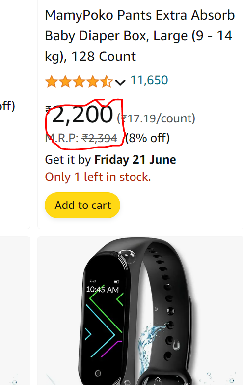
  1. Anchoring Bias: E-commerce applications can strategically use pricing information to influence users' perceptions of value. For example, displaying a higher original price next to a discounted price can make the discount seem more appealing.

  2. Social Proof Bias: Including customer reviews, ratings, and testimonials on product pages can leverage social proof to build trust and confidence in the product, encouraging users to make a purchase.

  3. Scarcity Bias: E-commerce applications can create a sense of urgency by highlighting limited stock or limited-time offers, tapping into users' fear of missing out (FOMO) to prompt quicker decision-making and increase conversions.

  4. Choice Overload: Offering too many product options on a single page can overwhelm users. E-commerce applications should provide filtering and sorting options to help users narrow down their choices and find the products that best meet their needs.

  5. Endowment Effect: E-commerce applications can use personalized recommendations based on users' browsing and purchase history to make them feel a sense of ownership over the suggested products, increasing the likelihood of a purchase.

By understanding and addressing these UX laws and cognitive biases, e-commerce applications can create more intuitive, user-friendly experiences that drive engagement and conversion rates.

        Website Analysis: Amazon


Amazon is the top e-commerce site in India.  It is one of the example of applying UX laws and cognitive biases. Here’s how Amazon leverages these principles we will look in to it.

1. Hick’s Law : Amazon categorized menus and filter options simplify decision-making, helping users quickly find what they are looking for.
Example:1


example:2

2. Fitts’s Law: Amazon uses large, clickable buttons for key actions like “Add to bag” and “Buy Now,” making them easy to locate and interact with.


3.Jakob's Law: Users expect e-commerce websites to follow familiar patterns and conventions. Keeping navigation consistent with industry standards and competitors' websites helps users navigate intuitively, reducing cognitive load.


Let's say for example you're designing a checkout process for your e-commerce platform. Instead of inventing a completely new checkout flow, you should adhere to common industry standards and conventions that users are already familiar with from other e-commerce websites they've used.

For instance, placing the "Proceed to Checkout" button in a prominent position at the bottom of the shopping cart page is a common convention in e-commerce. Users expect to find this button easily accessible when they're ready to finalize their purchase.

If you were to place this button in an unconventional location or use non-standard terminology (e.g., "Finalize Purchase" instead of "Proceed to Checkout"), it could confuse users and disrupt their checkout experience. By following Jakob's Law and sticking to familiar patterns, you can make the checkout process more intuitive and user-friendly, ultimately improving conversion rates and customer satisfaction. Amazon following this law as shown in the figure.

4.Law of Proximity: Grouping related items, such as product details and customer reviews, close together on a product page helps users associate information easily, enhancing their understanding and decision-making process.

5.Miller's Law: Limiting the number of items displayed on category pages to around 7 (plus or minus 2) can prevent users from feeling overwhelmed and improve their ability to compare products effectively.

6.Anchoring Bias: E-commerce applications can strategically use pricing information to influence users' perceptions of value. For example, displaying a higher original price next to a discounted price can make the discount seem more appealing.

7.Social Proof Bias: Including customer reviews, ratings, and testimonials on product pages can leverage social proof to build trust and confidence in the product, encouraging users to make a purchase.


8.Scarcity Bias: E-commerce applications can create a sense of urgency by highlighting limited stock or limited-time offers, tapping into users' fear of missing out (FOMO) to prompt quicker decision-making and increase conversions.

9.Choice Overload: Offering too many product options on a single page can overwhelm users. E-commerce applications should provide filtering and sorting options to help users narrow down their choices and find the products that best meet their needs.
10.Endowment Effect: E-commerce applications can use personalized recommendations based on users' browsing and purchase history to make them feel a sense of ownership over the suggested products, increasing the likelihood of a purchase.

 Conclusion

Understanding and applying UX laws and cognitive biases , as per my analysis amazon application is the user-friendly and effective website. 


Monday, June 3, 2024

A Simple Way to Creating Website’s Navigation Plan

Creating a website map (also known as a sitemap) is an essential step in the UI/UX design process as it helps visualize the structure and hierarchy of website's pages. Here's a simple guide to creating a website map with UI/UX considerations:

  1. Start with User Goals:

    • Identify the primary goals and tasks that users will want to accomplish on your website. This could include finding information, making a purchase, signing up for a service, etc.
  2. List Main Sections:

    • Identify the main sections or categories that your website will have. These could include Home, About Us, Products/Services, Blog, Contact, etc.
  3. Hierarchy and Navigation:

    • Determine the hierarchical relationship between sections and sub-sections. This will help establish the navigation flow of your website.
    • Use clear and intuitive navigation labels that accurately represent the content within each section.
  4. Consider User Flow:

    • Think about the most common user journeys and how users will navigate through your website to accomplish their goals.
    • Ensure that important pages are easily accessible within a few clicks from the homepage.
  5. Visual Representation:

    • Use shapes or boxes to represent each page or section of your website.
    • Connect these shapes with lines to indicate the flow of navigation between pages.
    • Use different colors or styles to distinguish between different types of pages or sections (e.g., main pages, sub-pages, landing pages).
  6. Include Key Features and Functionality:

    • If our website includes special features or functionality (e.g., search bar, filters, forms), include them in the sitemap to visualize how they fit into the overall structure.
  7. Mobile Responsiveness:

    • Consider how the website map translates to mobile devices. Ensure that the navigation remains clear and intuitive on smaller screens.
  8. Feedback and Iteration:

    • Share the website map with stakeholders, team members, or potential users to gather feedback on the organization and flow of the website.
    • Iterate on the website map based on feedback, making adjustments as necessary to improve clarity and usability.
  9. Finalize and Document:

    • Once the website map is finalized, document it for reference during the design and development process.
    • The website map can serve as a blueprint for creating wireframes, mockups, and prototypes.
  10. Update as Needed:

    • As your website evolves or new features are added, update the website map to reflect these changes and ensure it remains an accurate representation of your website's structure.

By following these steps, we can create a clear and effective website map that serves as a foundation for designing a user-friendly and intuitive website.

Tuesday, April 16, 2024

Understanding Research methods and research data collection


Goal: As a UI/UX designer my goal is to design and implementing a user friendly time management application. It's refers how to handle both professional and personal life (spend quality time with family even though when the  person was busy).

Objective: here I need to follow  few methods(objectives) to reach my goal

1.Secondary Research

2.Competitive Analysis

3.SWOT Chart Analysis

4.Primary Research.


Quality time with family

Assumptive Problem Statement

 A business man(USER) who wants to spend quality time with his family(GOAL) but unable to spend time due to lack of time management(PAINPOINT).

Lack of time management(Busy with meetings and commitments)


           Discover phase

                        
1.Desk Research

2.Competitive analysis 

3.SWOT Analysis 

4.Primary Research

1.Secondary Research/Desk  Research: 

As per my analysis I gone through the secondary research by different articles and blogs. Here my analysis is the person who needs a quality time with a family they need to fallow few steps given bellow


1.More than half of parents are too busy to enjoy the fun of parenting, according to a new survey.

2.Remove distractions from your routine (Turn the Mobile Phone Off/Have fix the time for social media)

3.17 minutes Break for every 52 minutes work schedule.

4.Fallow 1440 rule("Take care of the minutes and the hours will      take care of themselves")

5.First priority goes to most important task(MIT),Say no for remaining works..

6.Instead of todo list maintain Time boxing(Time boxing means        setting a fixed amount of time in your calendar for a particular    task

7.Imagine your future self(Your  future is created by what you do    today, not tomorrow

8.Step into Your Teen’s World

9.Exercise Together

10.Share household chores

11.Make Your Spouse Feel Special

12.Celebrate Family Traditions

13.Reduce the scope don't skip the task

14.Ask Your Kids to Give Grandpa and Grandma a Call

15.Show Your Parents You Care

16.Share Family Stories

17.Plan a Monthly Excursion

18.Bring Your Child to School or Class

19.Find your kids goals

20.Fix things together

Key insights:
1.The survey found that 82% of children are suffering from some psychological conditions like loneliness because no presence of parents they addicted for mobiles.

2.40% Indian parents of kids aged 9-17 admit their children are addicted to smart phones


3.While 73% of children miss their mobile while they are at school, 77% of children demand mobile phones once they return from the school.

4.65% of employees report that workplace stress has caused various difficulties in their lives.

5.Additionally, about 10% say that workplace stress has caused major issues in their personal lives.

6.83% of workers say their personal relationships are negatively impacted by burnout from work.
               
      
However, currently, only 14% of businesses in India are led by women. 
The latest census indicates that of 58.5 million entrepreneurs in India,
about 8.05 million (13.76%) are women. While there has been some growth in the number of women entrepreneurs, it's been slow and uneven, and more progress is needed

More than half of parents are too busy to enjoy the fun of parenting, according to a new survey.

The recent poll of 2,000 parents (with children aged 3–16) found that 55 percent believe they’re missing out on the fun of parenting due to their other obligations.

In fact, 67 percent of parents worry about missing special moments while their little ones are still young – and 40 percent admit they’ve already missed at least one important milestone in their child’s life.

Results showed that 78 percent wish they had more time to spend with their kids, while 82 percent of the parents studied feel their children are simply growing up too quickly.

Here are few references you can refer to where I get this information:

1.https://www.verywellfamily.com/finding-quality-family-time-616982

2.https://nypost.com/2019/11/07/a-lot-of-parents-think-theyre-too-busy-to-have-fun-with-their-kids/

3.https://www.businesstoday.in/latest/trends/story/40-indian-parents-of-kids-aged-9-17-admit-their-children-are-addicted-to-smartphones-survey-355128-2022-12-02

4.https://www.michaelpage.com/advice/career-advice/growing-your-career/5-tips-better-your-time-management

5.https://www.linkedin.com/pulse/balancing-family-business-life-sumundikeepsales-2lfte/

Competitor Analysis:


  1. Direct Competitor: Todoist, Trello, Asana, Toggl Track, Click Up, Pomodoro.

  2. Indirect Competitor:-  YouTube, Instagram, Facebook.


Feature Analysis:


Strengths:
  1. User-Friendly Interfaces

  2. Cross-Platform Accessibility

  3. Integration with Other Tools

  4. Customization Options

Weaknesses:

  1. Dependency on Internet Connection

  2. Data Security Concerns

  3. Learning Curve

  4. Limited Offline Functionality

Opportunities:

  1. Integration with Emerging Technologies

  2. Expanding Market

  3. Partnerships and Collaborations

  4. Focus on Wellness and Work-Life Balance

Threats:

  1. Competition from Established Players

  2. Changing User Preferences

  3. Security and Privacy Regulations

  4. Technological Disruptions

Overall, conducting a SWOT analysis can help time management app developers and companies identify their strengths, weaknesses, opportunities, and threats, enabling them to make informed decisions and develop strategies to stay competitive in the market.

Primary Research:

Qualitative Research:

Demographic:

1.Can you start by telling me a bit about your self?

2. Which age group do you belong to?

3. What is your current occupation?

4. How often do you use online time management apps?

Follow Up:

5. How do you currently manage your business and family?

6. What would make you more likely to recommend a time management app to others?

Goal:

7. What are your main motivations for using a time management app?

8. What are the biggest challenges you face when it comes to managing your time and tasks?

Pain point:

9. Have you encountered any frustrations or limitations with existing time

10.How do you ensure that your daily activities and tasks are aligned with your long-term goals and aspirations?

Value:

11.What are the most important aspects of your life that you strive to balance and manage effectively?

12. Can you describe a time when your values influenced your decisions about how to allocate your time?


Understanding UX Laws and Cognitive Biases by Analyzing a E-commerce Website

UX Laws in E-commerce Applications : Hick's Law : In an e-commerce application, offering too many options on a product page can overwhel...