Overview :
User Experience is one of the hottest topics in day today designer’s life. To make our product success and stand out from our competitors, we should ensure that we are treating our users in the best way. When it comes to modern-day users, who are much familiar with the latest technologies, it’s more than a visually appealing interface. This is where the term User Experience design step in.
We often choose different UX methods for different projects based on its complexity to get the best solutions.
Among these processes, the heuristic review is one of the useful methods to figure out the usability issues and solving it based on its severity.
We use ‘usability heuristics’ as guidelines to run this UX process.
In this blog, I am doing analysis about Ecommerce application like Amazon to find usability errors and level of severity of these application to advanced walkthrough on “Jakob Nielsen’s 10 Usability Heuristics” that are considered as the ideal guidelines for completing a heuristic evaluation. Even though it’s date back to 90s, it’s still relevant and useful.
The 10 usability heuristics are:
1.Visibility of system status:
How well the state of the system is conveyed to its users. Ideally, systems should always keep users informed about what is going on, through appropriate feedback within reasonable time.

For example , the above screen shot of Amazon application, when a customer taps to place an item in the basket, the addition should be visible immediately in the basket at the top of the screen. Visual feedback from the state of the button itself helps too.
Suggestion:
As per above screenshot when the customer need to place a single item in the basket, the addition of the items needs to be delete or remove from the cart, so here need a improvement on it.
Severity rating :1
2. Match Between System and the Real World
The second heuristic emphasizes the importance of designing interfaces that match the users' existing knowledge and mental models. In other words, the system should speak the users' language, using familiar terms, phrases, and concepts. This way, they can easily understand and navigate the system without the need for extensive learning or training.

In the above screenshot for example after add the items in cart need to select the payment methods like how we will pay the money through UPI transaction or debit card or credit card etc.
when will select electronic transaction need to enter card number and name, expiry date etc.
Instead of these if we can see a help animation/image on the top for the screen.
The users can relate these graphics with a real payment card and fill up the details without any confusion even if they are not familiar with net banking. Here we are making things pretty straight-forward and easier. like bellow screenshot.

Severity rating :1
3. User Control and freedom
User needs complete control and freedom over the entire system. The system should help them to undo an action that happened by mistake. Frustrating usability issues would never help to retain users. That is how it is becoming one of the important points in this topic.

In the above Amazon screenshot, when we add the item in cart unfortunately here we have a option undo like delete or save for later is best example for user control and freedom.
Suggestion:
- Clearly label and place your "Exit" or "Cancel" buttons in the user interface so the user quickly understands how to exit or return to a previous stage.
Severity rating :1
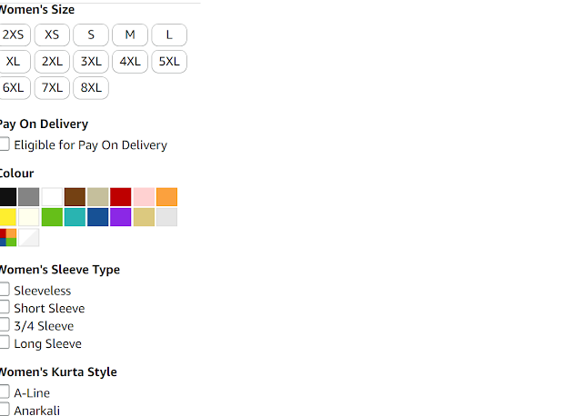
- 4. Consistency and Standards
- "The next usability heuristic refers to the idea that design elements, such as fonts, colors, buttons, and formats, should be uniform throughout a website or application. In other words, users should not have to relearn how to navigate the site as they move between pages.
- There are 2 types of consistency as mentioned by Jakob Nielsen:
Internal consistency: Internal consistency: It refers to maintaining consistency within a product or a family of product like Amazon and amazon prime.
 Suggestion :
- In the above Amazon screenshot same brand(Anouk) kurta's they follow different standards. In simple term, A system or a product should never ever confuse the users by using different words, actions, color design, or situations to derive the same meaning
- External Consistency: for external consistency In amazon website
- when purchasing products. there are guidelines for viewing a product, saving an item for later, and adding an item to the shopping cart these guidelines provide standards.

Best example for external consistencySeverity rating :1
- 5: Error prevention:
- Good error messages are important, but the best designs carefully prevent problems from occurring in the first place. Either eliminate error-prone conditions, or check for them and present users with a confirmation option before they commit to the action.
There are two types of errors: slips and mistakes

In the above Amazon screenshot user need ethnic wear instead off E user search A. So there is no search result its called slips.
coming to mistakes while making the password for the amazon website during the signup stage, the system guides the user by indicating what should be combination to make strong password.
Severity rating :1
- 6. Recognition Rather Than Recall
This heuristic emphasizes the importance of making information and actions visible and available in the interface rather than requiring the user to remember them. This heuristic aims to create an interface that is more intuitive and easy to use by reducing cognitive load and memory demands on the user.

- In amazon recently viewed items on its home page, which is an excellent example of recognition rather than recall. This feature makes it easy for users to find items they recently browsed. They can navigate away from the page and toward other products without losing their place on the original page. This lets users easily compare products on amazon and complete purchases faster without having to track down previously-viewed product
Severity rating :0
- 7. Flexibility and Efficiency of Use:
- Flexible processes can be carried out in different ways, so that people can pick whichever method works for them.


Amazon many filters are a good example of this heuristic. Users can find the product they want in many different ways depending on their needs, their priorities and the way they use to browse as shown like above screenshot.
Severity rating :0
8. Aesthetic and Minimalist Design
This heuristic recognizes the importance of designing a visually appealing and simple interface. The goal is to create an elegant and functional interface that is not cluttered with unnecessary design elements. These interfaces are easy to navigate and help users focus on the primary task at hand.

Amazon search is a great example of an aesthetic and minimalist design. When users open amazon app they are presented with a simple, uncluttered interface. The white background and minimalistic design allow users to focus on the main task of entering their search query.
suggestion:
Limiting the number of colors and fonts on your web page or app will create an interface that looks unified and cohesive.
Severity rating :1
9.Help Users Recognize, Diagnose, and Recover from Errors
Error messages should be expressed in plain language (no error codes), precisely indicate the problem, and constructively suggest a solution.
These error messages should also be presented with visual treatments that will help users notice and recognize them.
Along with the error message, provide suggestions for recovering from the error. This could include providing options or links to help the user fix the problem or seek additional assistance.

Severity rating :0
This heuristic design principle recognizes the importance of providing users with adequate help and documentation to assist them when they encounter issues while using your interface. This includes instructional materials, FAQs, user guides, support chat, and other resources that provide additional information about the product or feature set.

As per above screenshot we can connect with customer help service regarding any issue like order and returns as shown in the above any complaint.
Severity rating :0
Conclusion:
As per my analyses amazon ecommerce application is user friendly interface.
Overall severity rating:1
Thank you
:


No comments:
Post a Comment